Character Design and Consistency
So, one thing I’ve grown to appreciate since starting a comic is it’s really, REALLY easy to go off-model. Most (all?) sequential artists and animators know this. And now I’m gonna try to talk about it ahahahaha *sobs*
So when I say consistency (for the purposes of this post anyway), I’m talking about drawing your characters over and over and having them look the same. No matter the composition, they should be recognizable and look like they belong in the same world every time you draw them.
The short answer to this is to draw draw draw. It’s really about being familiar with your designs, and the only way to get familiar with them is to draw them a lot. But that’s pretty abstract advice, so we’re going to look at various systems for learning consistency.
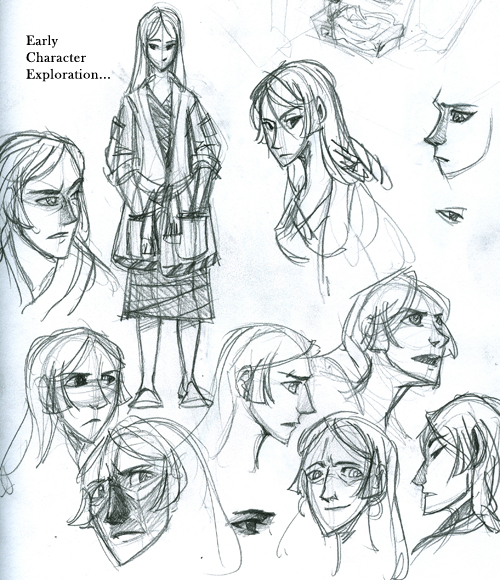
Consistency’s all about understanding the design choices you’ve made, and sticking to them. You’re essentially establishing the rule book for how your characters are drawn. Now full disclaimer, I’m very much into asymmetry and energy over accuracy. I find that if I get too technical with my drawing, that’s when I screw up. So I never think too hard about consistency; mostly I just try to get my drawings in the right ballpark.
It’s not really about details, not entirely. It’s about big picture. Establish the big choices, and then work your way in.
SHAPES
So I’m all about shapes in character design. I try to keep them basic. This doesn’t just apply to the overall figure. What are the shapes of the eyes, the hair, the clothing? What do they look like in profile, or in motion? How should they look?
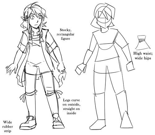
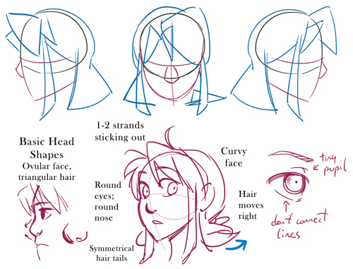
When you know your character’s shapes, it’s much easier to control those small details that give your character life on the page.
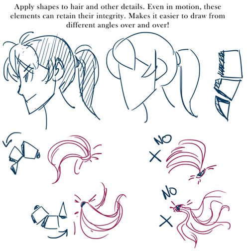
You’ll do yourself a lot of favors by keeping your designs as simple as possible. I’m not saying they all need to look like cartoons – I mean be mindful of eliminating useless noise. Too much detail can clutter up a design, which is why starting with broad shapes is so important.
STYLE
Somewhere in the character creation process – preferably somewhere early – you’ll be establishing visual style. Are these characters going to be realistic or cartoony? Are shapes very literal, or subtle? For MFK, I knew I’d be sticking close to an anime-inspired style, with some flexibility. Most key characters have more superhero-type proportions, but I’m open to getting a little crazy with supporting characters. The visual style walks the line between stylized and realistic. To make this work, I keep proportions on all characters relatively exaggerated and line work to a minimum, even unfinished in places. It’s a personal preference, but I also stay away from straight lines and sharp angles. Even the most angular characters have a bit of curve in their design.
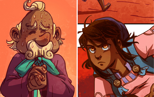
This is broadly speaking. Within your chosen visual style, you’re free to do whatever you like. Characters don’t all need to look the same – in fact, they shouldn’t.
SILHOUETTES
Let’s talk silhouettes next. The theory here is that if you were to line your characters up, then fill them all in with black, you should still be able to recognize each character.
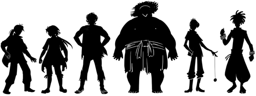
Like this.
This ties in with establishing shapes and is also a good starting point when designing. This is when you think about how your character carries themselves, how the little details break up the silhouette and make them unique. At this stage, I start with a big brush (a Sharpie or marker if I’m working traditionally) and just start making broad strokes. Then I work smaller and smaller to add or take away details.
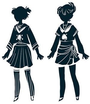
TIP: This is also a good guide when drawing your characters in action. If you filled them in black, would you be able to tell what they’re doing? Character pose is also a storytelling tool.
You don’t need to stick rigidly to your silhouette, but you do need to understand what features make your character recognizable. And this is not simply the clothing, the hairstyle, height and proportions, all those things, but the shapes of them.
Everyone recognizes Mickey Mouse’s silhouette, right? What’s interesting is that the shape of his ears is maintained no matter at what angle his head is drawn.
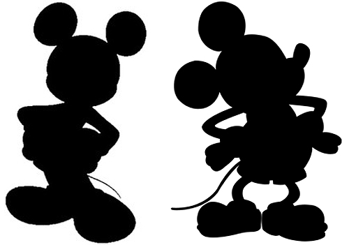
This was a design choice. These are the rules in the world of Mickey Mouse. It’s this silhouette that differentiates Mickey from every other mouse character.
Now, you are establishing your own design rules. You can make them whatever you want them to be. But, they’ve got to be believable (note I do not say “realistic”).
CHARACTER SHEETS
This is the part where we talk about drawing your character over and over. Once you have the design pinned down, it’s time to try it out in various conditions. Push and pull it every which way, and figure out its limits.
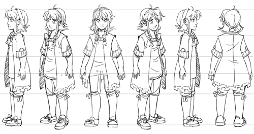
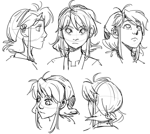
The turnaround is a common tool in animation. It’s a technical drawing that explores the design from multiple angles. Turnarounds are a handy way of getting the proportions and smaller details of your design down on paper. As such, they should be clean, specific, and detailed.
Here I’ve done a similar thing, just focusing on the head.
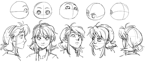
This is the time to discover the problems in your designs and work out solutions.
TIP: I don’t know about you, but my ¾ views are almost always lopsided. To check how you’re doing with a ¾ view, hold your drawing up to a mirror, or if you’re working in Photoshop, flip it horizontally. You’ll be able to tell if something’s off and correct that way.
I’ll be honest, I don’t use turnarounds so much for comics. Instead, I just sketch my characters a lot. I focus on full-body poses as well as the face. I like to think ahead about what actions my characters are likely to take, or the emotions they’re likely to experience. Don’t restrict yourself to one angle – try them from all different views.
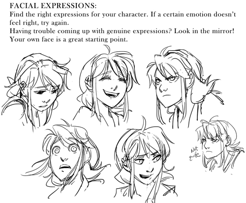
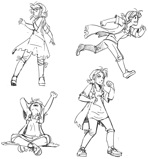
The more you draw your characters, the more familiar you will be, and the better prepared you are when it’s time to work on those pages.
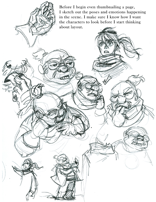
Brianne Drouhard and Tracy Butler do amazing amounts of drawings of their characters. They’re both good reference points for this sort of thing. Speaking of…
REFERENCE
All this work you’ve done is going to be reference as you’re working on your comic/book/animation/what have you. Keep your character sheets and sketches handy as you’re drawing. When I’m working on a new page, I always have the last few pages up so I can look at how I’ve drawn the characters before.
So yes, there’s a lot up there about character design, but I feel that the key to consistency is having a solid design foundation. Make a study of your characters – draw them from the ground up, take notes, do what you need to do. Establish your rules, then stick to them. Hope this helps!
This was nice to read as someone looking to see if other comic artists uses turnarounds. Good luck on your art journey!
Thanks for reading, and good luck to you as well!
Love, love your books! And your blog posts are very insightful and informative for an aspiring graphic novelist! I really love this input on development of character design! I hate to be n annoying fan and you’ve probably answered this a million times but will there be a continuation of M.F.K.? Thanks for all you do and keep being awesome!
Gosh, I hope so! One of these days. XD The balance between self-indulgent personal project and contract work that pays the bills is a tough one to maintain. But, once I have free time again, I definitely want to get back to M.F.K.
Thanks so much for your comment and support!
Thank you Nilah for writing this! I found this very helpful and informative, as I’m working on my own comic. I never thought of sketching out poses and emotions my characters will take, BEFORE thumbnailing the page! That’s a great idea you thought of.