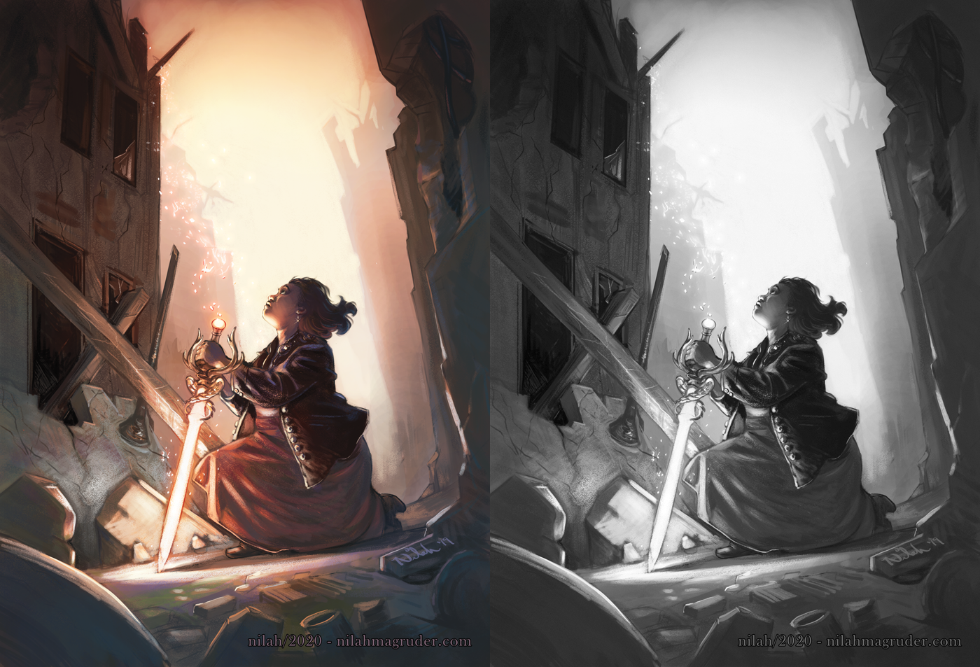
Lighting Dark Skin, Part One: Color and Identity
This topic confused some people the last time I brought it up, so let me be clear.
This is an art post about how to observe and paint light and shadow on human figures with dark skin. It is not a post about what colors you should use when painting dark skin. It is a post about values, contrast, the temperature of color, and how to balance them all together. Nothing I say here is revolutionary. In the end, it’s all color theory, but perhaps saying the words will help a few artists find direction.
First Things First…
An idea exists—whether because artists actually believe this, or they simply make the argument to avoid criticism—that the correct approach to rendering a dark-skinned character in a scene with strong lighting is to lighten the skin. And by “lighten the skin,” I mean increasing the flat neutral value of the subject’s skin so that it is closer to white than black. I think two things are happening here.
Number one, art instructors and schools do not include dark-skinned subjects in their curricula. When I went through art instruction, Black, Indigenous, and Asian studio models were rare to non-existent. The models were usually white and fair-skinned. Any conversations we had about warm and cool approaches to skin focused on white bodies. Many artists are fumbling their way through painting dark skin using techniques designed to highlight light skin.
Number two, artists feel uncomfortable painting dark skin. This is in part because of the lack of proper instruction in how to do so, and also because, as a global society, dark skin has been burdened with stigma. Dark skin is seen as undesirable, while lighter skin is a sign of beauty. Whether or not an artist is consciously aware of this belief, it is the overwhelming message we receive in art and media, so many artists subconsciously avoid dark skin by painting it lighter.
And perhaps a third thing, that is really a part of the two but still worth pointing out on its own, is a lack of photo reference with dark-skinned models in a variety of lighting schemes. Photography is also a space where dark skin has been neglected. Illustrators, painters, and other such visual artists commonly use photo reference to assist in their work, and it is good practice to do so. However, the lack of proper photo reference means that artists either must create their own (also a good practice), or must invent the lighting effects they wish to create in their work, or they must rely on bad photo reference that does not reflect true real-world lighting.
This feels like a good entry point into the discussion.
White Balance: the Problem with Photo Reference
I am an enthusiastic advocate of using photo reference, but when it comes to color, we must acknowledge that cameras are not great at rendering the world as we see it.
We, humans, see the world in three dimensions, in a wide scale of values and contrast. We do not all see the world in the same hues, which is why value is so important. Values tell us the shape of objects. Contrast helps us differentiate between objects in a world full of visual noise. Together, they help us navigate the world around us.
Cameras, by their nature, flatten things. They take our three-dimensional world and knock it down to two dimensions. Cameras generalize and simplify. They do this with objects, they do it with value and contrast, and they do it with color.
To illustrate this point, I spent an entire day taking extremely bad photos of my face.
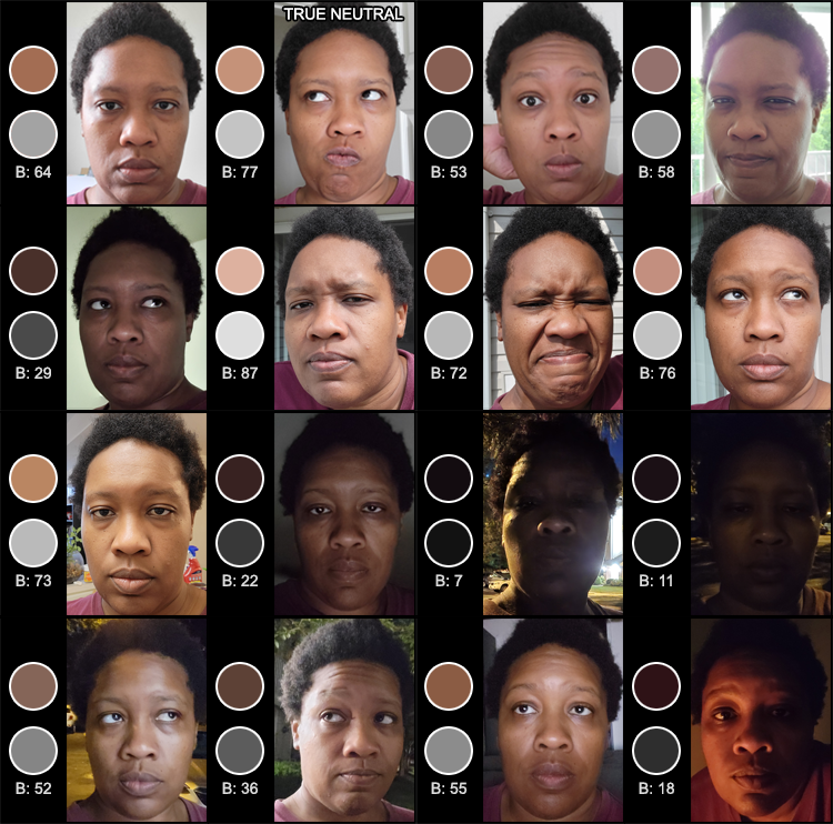
White balance was working hard that day.
All of these photos were taken in the same twelve-hour period, at different times, in different locations. For each photo, I sampled a pixel from roughly the same spot on my forehead that seemed to hold the value closest to neutral in that particular photo. The hue and value percentage are recorded on the left (0 is black, 100 is white, and 50 is the middlemost value). Here’s the important thing to note:
My skin’s complexion has not changed. It remained the same all day. It doesn’t change based on my environment. I am not an octopus. Now, my skin does get a little lighter in the winter since I’m indoors more, and it gets darker in the summer with exposure to the sun, but this is a change that happens over the course of months by subtle degrees I wouldn’t expect anyone to notice, and if you did notice, I would assume you are an extraterrestrial. I would not report you to the government, but I’d think about it.
And yet, there are wild fluctuations in the value percentages of these photos. The darkest is 7. The lightest is 87. But the thing changing is not my complexion.
What does change is the light source and how it bounces off my skin. In low light, there’s not a lot of light bounce. In intense light, the light is reflected in my skin in large patches, sometimes dominating entire planes of my face. This is still not an accurate reproduction of my face in real-world lighting conditions because of white balance.
White balance is the technique cameras use to determine how to balance colors against one another in an image. It does this by looking for white in the scene you’re photographing. Photographers can do this manually by establishing an actual plane of true white in the scene: maybe a white wall, or maybe by holding up a white card in front of the camera. With this as a reference point, the camera is able to interpret the color temperatures in the scene and adjust the image accordingly.
Many modern cameras do this work automatically. The camera is constantly adjusting how it reads color temperatures and lighting conditions in order to produce the clearest image possible. And thus we come to a very important consideration when using photo reference:
The camera is a manipulation tool. It is a tool of two-dimensional art, taking a scene and creating its own interpretation of it. When your camera takes a photo, it flattens together the light source, the object’s local color, and the reflected light to create a generalized result. The image the camera produces does not represent the subject’s local color or values. It is an optical illusion.
That said, photo reference can be an effective tool. Under the care of a photographer and a carefully set up shot, a photo can produce fantastic, unique results. It can help you remember actual lighting conditions you observed with your own eyes, give you a jumping off point, or expand your perception of what colors are possible in a scene. But color picking from a photo in a digital art program will rarely give you the scene’s true conditions. Photos are best treated as reference, and not a diagram to replicate.
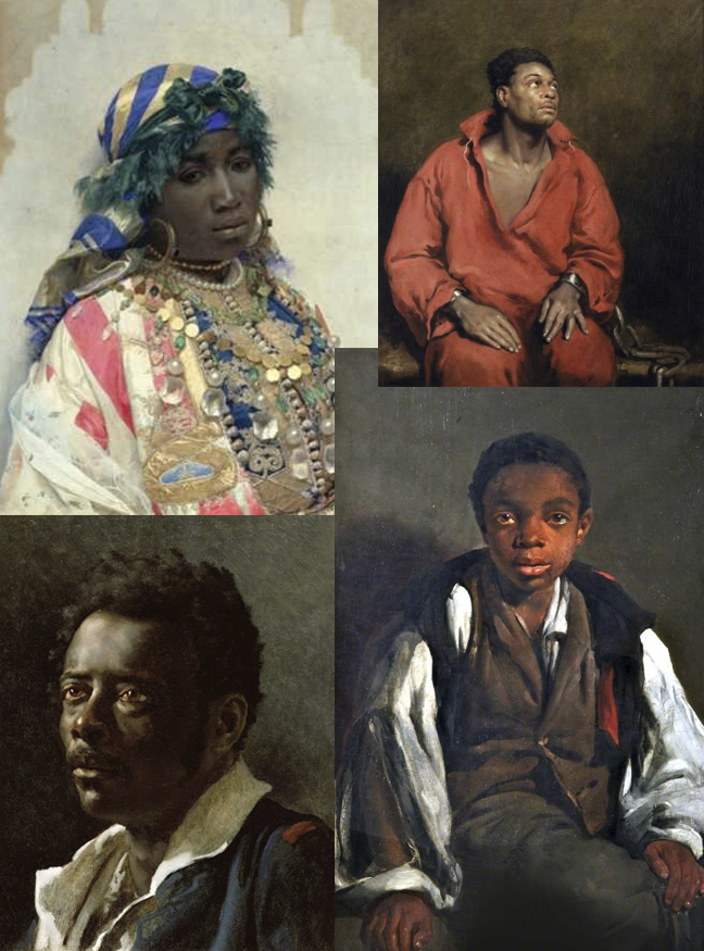
When artists prior to the 1900s painted people of African descent, the hues they used were rich and deep. I suspect the reason was because those artists were observing real live models, not photographs.
Loomis Gets It: The Strength of Color
I was assigned to read Creative Illustration by Andrew Loomis in an illustration class. When I got to the chapter “Color”, his words hit me like a brick to the head.
Loomis states, “The local color should never completely lose its identity in shadow.” I would also argue that for the dark-skinned subject, the local color should never completely lose its identity in light.
Loomis is very clear in his terminology. He starts with the definition of local color: color in a neutral light and without other influence or color reflection. Imagine your model in a gray or white-walled room under three-point white lighting. Your model’s skin under these conditions would be their true skin color.
From here on, all of Loomis’s descriptions of painting technique emphasize the effect of light and shadow on the local color. This takes into consideration the direction of light, the model’s angles and planes, and how the model may absorb and reflect color from nearby surfaces. When Loomis talks about lighting, he describes the light itself as bright or low, but when it comes to discussing the model under the light’s influence, he uses words like brilliance or intensity. He says “color is strongest in the light.” He does not say “color is lightest in the light.”
“Always paint your subject as brilliantly as possible, and let the engraver do the best he can with it. If you give him dead color, he can’t make it any better.” Always paint your subject brilliantly.
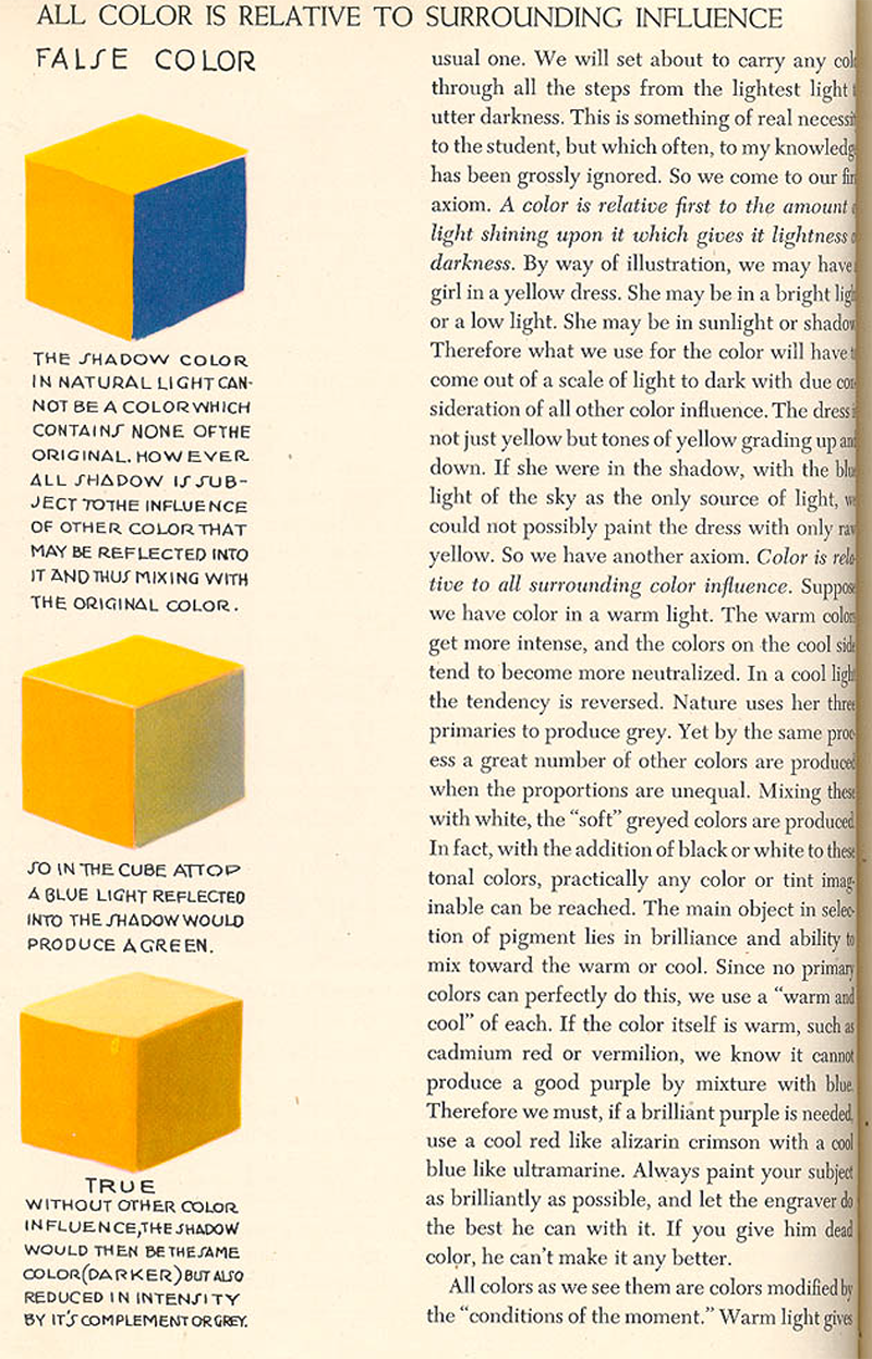
A page from Creative Illustration by Andrew Loomis.
In Loomis’s examples, the models and their environments exist in three dimensions. They are never flat, and thus light never falls evenly across a model. This, too, is important in the rendering of skin, and something our modern cameras in the hands of an untrained photographer do not always account for. The camera has a way of flattening a subject, but our eyes are much more sophisticated, and Loomis’s approach to painting is to mirror the world as humans see it, not as cameras do.
(That said, I do have thoughts about portraying dark skin in a flat style, which we will address in part two of this post.)
So, the planes of a model’s form may reflect light at different intensities, they may cast shadows at different intensities, and they may absorb color from nearby objects. Loomis makes another fine point: “Color is relative to all surrounding color influence.”
What does this mean? Surely you aren’t going to make me invoke the “is this dress white or blue” controversy. I suppose I don’t have to, since this phenomenon has been used many times on the Internet as an optical illusion. It is not necessarily a trick, just color theory. The way we perceive color in the real world is 1) based on how color reacts to its environment and 2) what we know the true color to be. As artists, it is important to understand how colors play against one another, since this impacts which hues we will choose to paint.

What Colour Are the Strawberries in This Picture? No red is used in this image, but our minds force red upon it, because we know strawberries are red. By playing with the balance of hues and values in a painting, an illustrator can create the effect they wish the painting to have on the viewer.
“All colors as we see them are colors modified by the ‘conditions of the moment.'” What is the temperature of the lighting? Is it warm, or cool? The temperature of the lighting, as well as the temperature of the model, affects how you will paint your scene.
The chapter is full of gems. If nothing else, I suggest all artists wishing to improve their approach to rendering dark skin read the chapter on color in Creative Illustration.
Why is it important to understand how light affects dark skin? Because, as illustrators, it is important that we understand how light affects the observable world. Interpreting life is our craft. Lighting an object is not as simple as drawing a wash of white paint across it. Were you to paint a black cat crossing into a wide beam of moonlight, would your approach be to paint the cat white? Or, if black skin under a strong light were to render it lighter, surely the same would apply to white skin under low light, and you would paint it brown instead. In these instances, we understand that lighting is not that simple. The lighting conditions may change, but the model does not lose its identity.
If that is not enough for you, then consider this: understanding how light affects dark skin increases the possibilities of how to paint dark skin. You are not limited to applying light tones to give the appearance of light. We are artists, not cameras, and it is our business to explore the possibilities.
The How of It
“So, Nilah, you’ve said a lot of things. But how do you paint dark skin?”
Many of the same principles for painting skin hold true no matter the complexion. The color zones of the face are the same on every person. All skin reflects light and color. The answer to painting white skin under a strong direct light is not to make it whiter, but to strengthen the color. I do believe many artists understand these fundamentals already, but are used to applying them to light skin. When it comes to navigating the unfamiliar landscape of dark skin, they become unsure and default to what they’re familiar with: light skin and light hues.
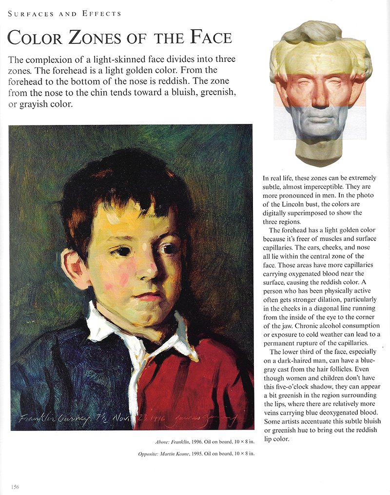
James Gurney’s Color and Light is an amazing resource for artists looking to improve their painting techniques.
The only answer for these artists is to move outside of their comfort zone. Get familiar with using colors in darker values. A dark model does not mean a dark painting. As with all art, it is about balance.
Surrounding Influence
Let us remember the words of Loomis: “Color is relative to all surrounding color influence.” This is also true for value. One way to control the value and color temperature of the subject is with the careful application of surrounding colors and values that complement the subject. If your subject is dark, but the background is darker, the subject will appear lighter than they really are (an optical illusion). If the subject and background are close in value, they may blend together. So, for a dark subject, sometimes the answer is a lighter background.

For the following examples, I’ve included a grayscale of each painting so that you can more clearly see the values. It is helpful to always think about value when you’re painting, whether by starting with a value study or monochrome underpainting, or if you work digitally, by starting with a grayscale painting and then switching to color when the values are established. Value, more than color, helps us read objects and forms.
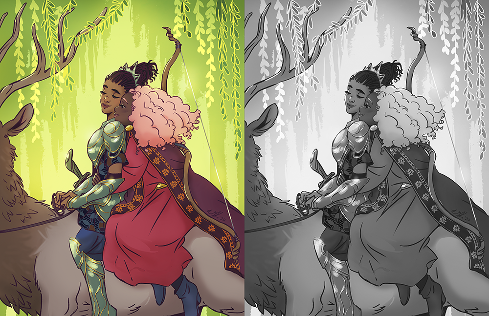
Here, I was working with two different skin tones. I used not just the background, but varying contrast in the characters’ clothing to help their faces stand out.

This piece was a particular challenge. I was working with a dark-skinned character as the focal point in a dark environment, deep under the sea with very little natural light. Getting the right balance of background value and skin tone value was tricky. I decided on cool tones (green, purple, blue) for the background elements to bring out the warmth (red and yellow undertones) in the main character’s skin. Then, I added few high points of value—the glowing eyes in the background, the reflected light on the sword—help establish the range from light to dark.
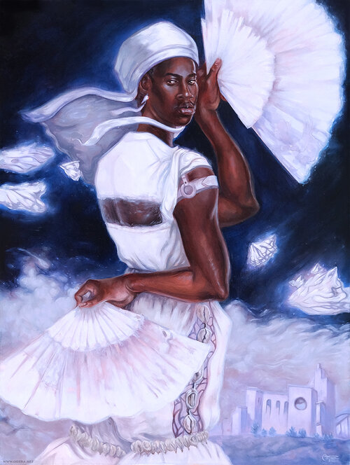
This piece by Odera Igbokwe also meets the challenge of dark skin on a dark background. Both elements are very close on the value scale. However, the character’s clothing and the other light areas in the painting push the contrast between foreground and background.
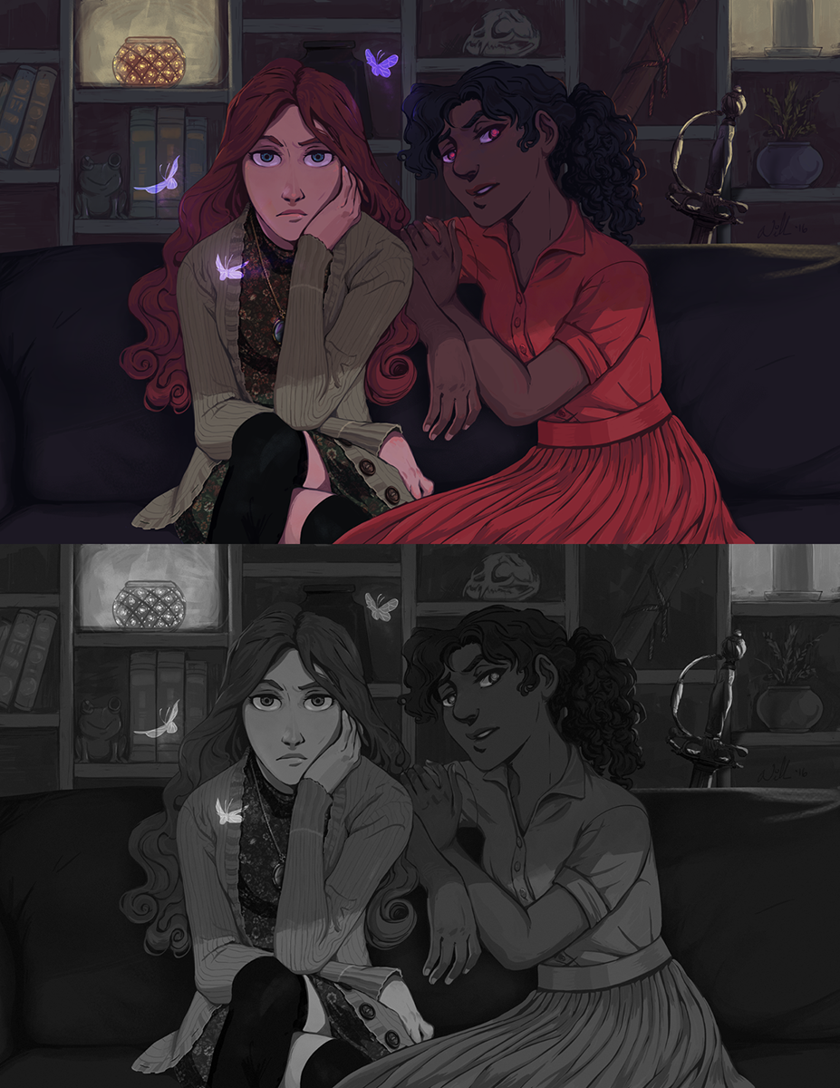
In this piece, the contrast element is a second character. The two have complexions at opposite ends of the scale that establish the range of value.
Most of these pieces also make use of lighting effects to help dark skin pop. To talk about that, I’m going back to what started the Twitter thread in the first place.
A Rim Light Really Is the Answer

This post started off as a simple observation I made on Twitter about a painting. Of course, it was Twitter, so the ensuing conversation was anything but simple.
The painting was by Eric Wilkerson, the cover for the upcoming Tristan Strong Punches a Hole in the Sky by Kwame Mbalia.
“I just want to point out something about how Eric Wilkerson handles the dark skin complexions in the TRISTAN STRONG cover. When lighting a person with dark complexion, the answer is not LIGHTENING THE SKIN, it’s understanding how light reflects off of dark skin.”
Skin is reflective. Light bounces off of it, and when that light has a color temperature, that color is reflected on the skin. Consider the color temperatures in your piece, your light source, how skin absorbs light and reflects color to create brilliant hues. 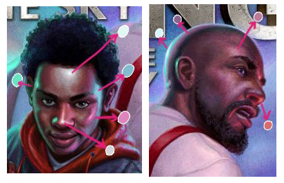
Note Wilkerson’s careful application of reflected light on the faces of his characters. He selects hot zones of the face where light is most likely to reflect. The color is taken from the surrounding environment. We see the impact of the intense lighting in the scene, but the highlights are contained and do not take over the entire face. Wilkerson leaves ample room for the characters’ neutral complexions. Light on skin should be placed strategically, and should never dominate the entire form. Remember, no matter the lighting conditions, the local color should not lose its identity.
In Wilkerson’s painting, he places a band of light at the edges of the face and the head to separate the character in the foreground from the background elements. The intensity of the light brings the figures closer to the viewer. Light is an excellent tool for drawing the eye and highlighting those areas of a painting that we want the viewer to linger on, but light needs not dominate the forms with which it makes contact.
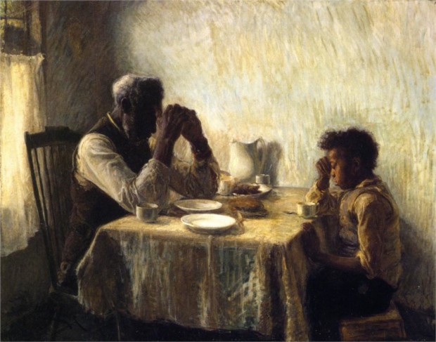
I love this piece by Henry Ossawa Tanner. The older man’s face is entirely obscured in shadow. We are, instead, directed to his hands, which are articulated with cool highlights. Meanwhile, the light that backlights the old man falls directly on the boy’s face, allowing us to see his features.
My tactic is always to keep things simple. When painting, I quickly establish the mid-tone (this is the local color), the lightest area, and the darkest area, so that I know my boundaries. On occasion, I will simplify even further by leaving out the local color.
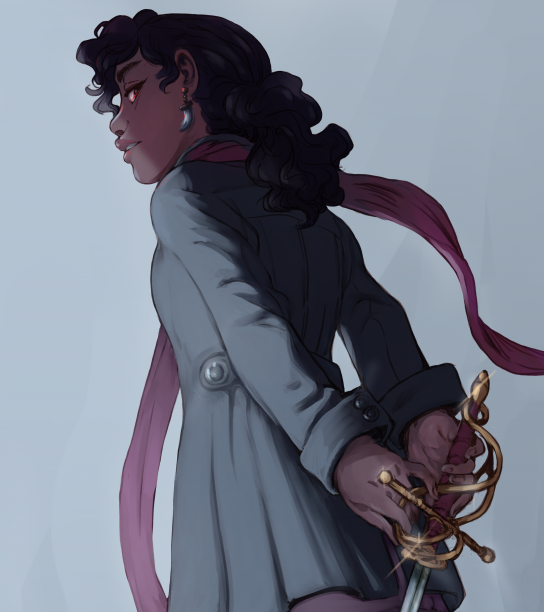
In this piece, I wanted to go for a diffuse, muted lighting scheme, like a foggy evening. A shaft of light cuts across part of the figure, but the rest has the appearance of being in shadow. I added a narrow, stronger rim light to the nose and chin just to add a bit of dimension, so really, the shaft of light serves as the mid-tone. Neither area reflects the character’s neutral complexion, but together, we get a general sense of how the character’s complexion might appear in neutral lighting.
Hopefully, this has given you useful concepts to think about as you approach painting dark complexions. The best strategy is to observe from life whenever possible, and to explore outside of your comfort zone.
This post is the first in a two-part series. Proceed to Part Two: Lighting a Flat World to read about applying these principles in a 2D style.
Referenced Artwork:
A Tangerian Beauty. Josep Tapiró Baró. c. 1891.
The Captive Slave. John Philip Simpson. 1827.
Portrait Study. Théodore Géricault. 1818-19.
The Black Boy. William Lindsay Windus. 1844.
Breath of Life. Odera Igbokwe. 2021.
Tristan Strong Punches a Hole in the Sky. Eric Wilkerson. 2019.
The Thankful Poor. Henry Ossawa Tanner. 1894.
Referenced Books:
Creative Illustration. Andrew Loomis. 1947.
Color and Light. James Gurney. 2010.




This is free school. I’d love to donate the day I turn a dollar from my art. Great lessons for my nascent illustration foray.
Fantastic blog post. Especially fitting as I am planning one based around how you took selfies in different lighting then sampled them.
I also liked the part where you said most accurate skintone representation is in neutral light. Neutral light would be 4000K light temperature for LED & when sun is at a 45 degree angle to the observer? Would you agree?
I think 5000K is too cool, although many say that is “daylight”. More like when sun is directly overhead or it’s overcast.
I was wondering if neutral grey is the best colour to wear for any skintone to be most accurate without adjustments later.
I appreciate all the varied art examples and focus on how color is relative–it’s really informative and helpful. I’ll have to check out that Creative Illustration book now, and think about these principles in all the art I encounter. Thank you!