Lighting Dark Skin, Part Two: Lighting a Flat World
This post is the follow-up to Lighting Dark Skin, Part One: Color and Identity. If you haven’t read that already, check it out.
In part one, I mainly focused on color theory. When I originally presented a quick overview of this topic as a Twitter thread, I got a question about coloring and lighting dark skin in a flat, 2D style. This post focuses on applying color theory for comics, animation, and other media that might have limits to how colors are rendered. It is sparse on explanation because the examples speak for themselves.
Expressing light and shadow in a flat style is arguably more of a challenge and requires some invention. In sequential art, you have an added element: the passage of time. Cartoons, both printed and televised, use a series of images to convey time. You are not restricted to a single image to portray lighting conditions. You can use multiple images to show shifting lighting conditions. Think about cartoons you’ve seen and how character palettes changed as they move through changes in light. This can give you an advantage when rendering character skin tones, but it can also be a challenge.
To begin, I’m doing this analysis in Adobe Photoshop, and I’ll be referencing the percentage of black in most of the examples (the attached image is of the Photoshop color picker). As mentioned in my other thread, looking at the black and white value of a composition is helpful.

On that note, let’s start with this spot color piece by Abelle Hayford. The approach to coloring is simple with one flat color for the skin tone, and two flat colors for the lighting. Note that the skin tones stay below 50% on the black-to-white scale.
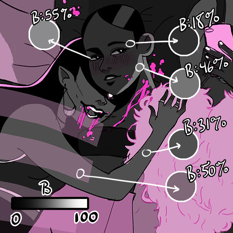
Hayford uses a minimal amount of color to indicate a strong, dynamic lighting situation. The lighting is located on one side of the characters, indicating the light direction, and is kept to the edges of their silhouettes. It doesn’t overpower their forms.
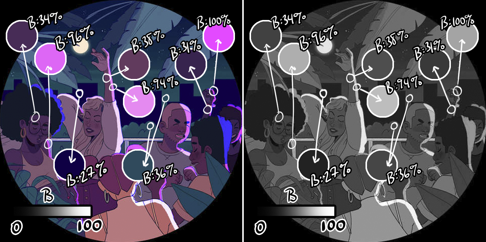
By using high contrast between the local (true) skin tones and the bright lighting in the image above, Hayford keeps the skin tones dark without causing them to be lost against a similarly dark background.

In full ambient light, like daylight, that high contrast scenario is built in! A light background will cause dark skin to pop. Here, even the rim of light on the character’s face is still darker than the light source, but its presence suggests a warm glow on the character’s skin.
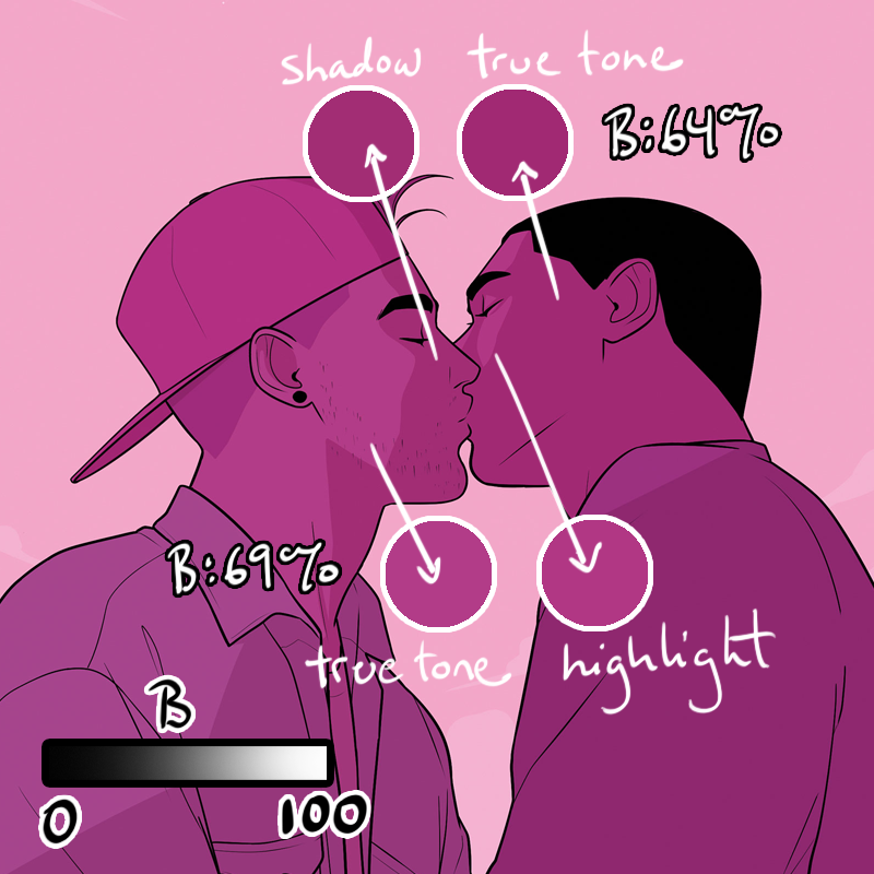
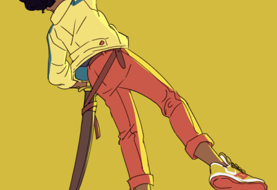
I love what Teo Hernandez DuVall does here with a very limited palette. One color serves as skin tone and highlight, while the other, darker color serves as skin tone and shadow. With two colors of subtle, but clear value difference, we interpret a difference in skin tone.
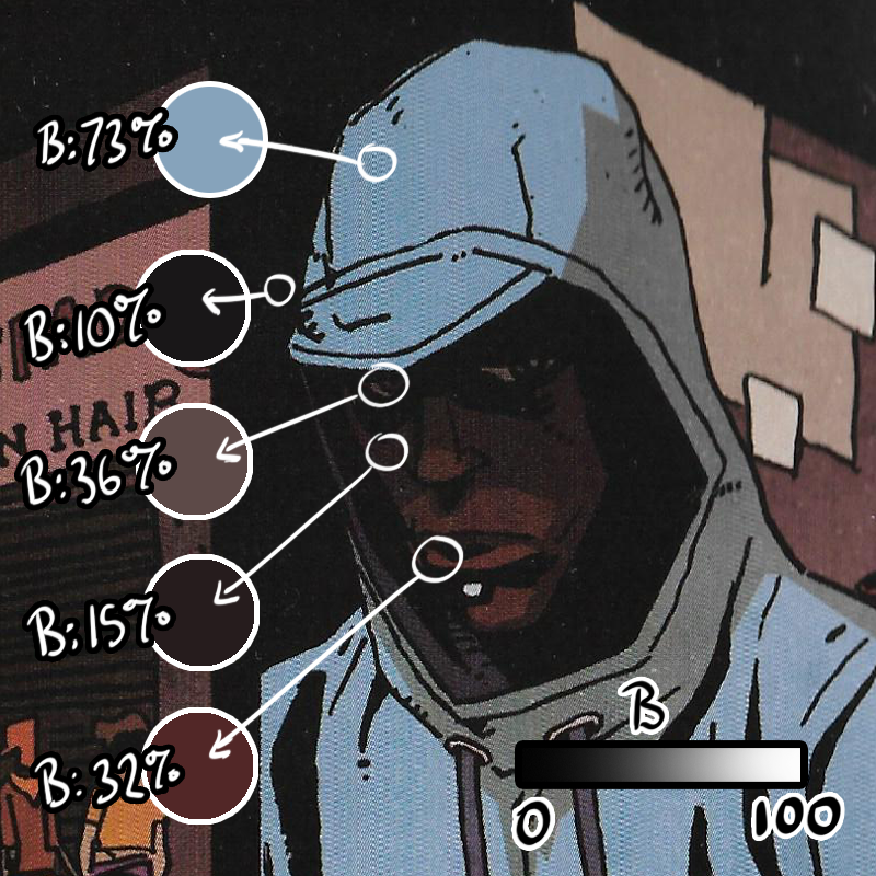
Prince of Cats by Ronald Wimberly is a thorough study in rendering dark skin in a flat style. Ronald boldly lets dark skin mingle with dark scenery, but note where lighter values are used to frame the face. Note how the eyes and mouth are lighter and become points of interest.
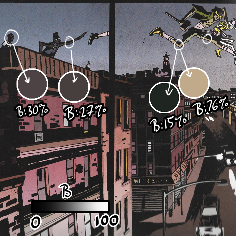
There’s an interesting negotiation here, where two characters are leaping from a dark lighting situation to the harsh lighting of the street. As the characters move from dark to light, the reflected light on the their skin becomes lighter. Light is balanced by black shadow. The light becomes a dominant shape, but it does not take over the character completely.
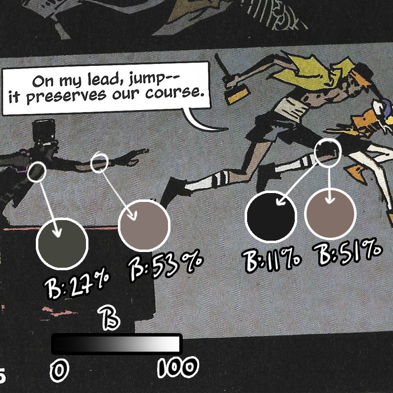
And, this transition is brief. The characters will return to their darker values on the next page.
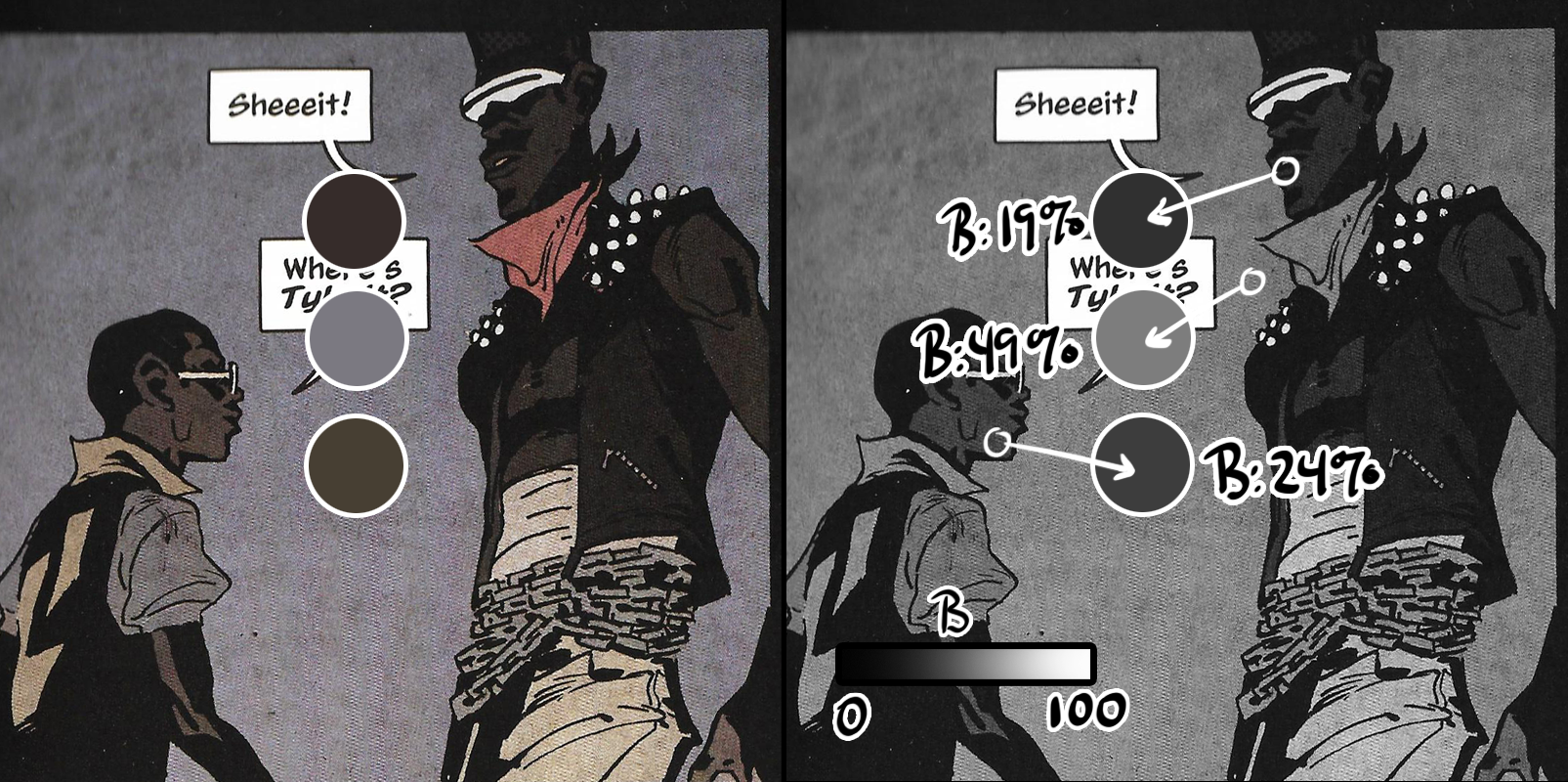
And check it: sometimes, the night sky is not the darkest element. Sometimes elements in the foreground appear darker. Yes, city = light pollution, and Wimberly uses this to great advantage to light his scenes, but this principle works in natural light, too. The next time you go camping or to a park at night, look up at the sky and observe how the trees are dark silhouettes against the blue night sky.
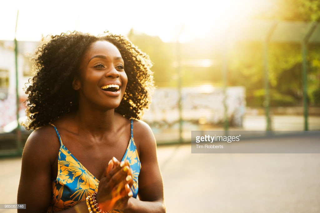
Photo reference is always a good starting point for studying dark skin and lighting, but remember: cameras lie. Our eyes adjust based on lighting conditions. When light is low, we pull it in from every source we can.
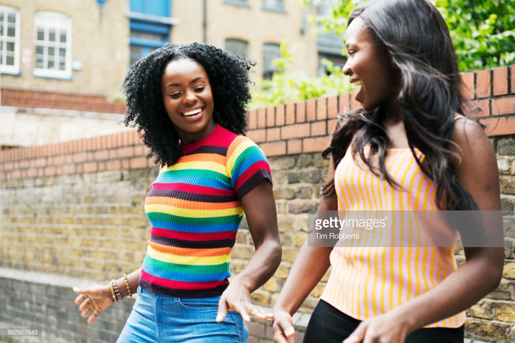
Cameras do this too, but on the way to processing information, cameras flatten color and forms. Our eyes, generally speaking, are able to perceive distance and negotiate around three-dimensional objects. As an artist, you’re not reproducing photographs. You’re recreating life.

What does this mean? You can get creative with lighting schemes.

My approach to coloring is not to paint the exact, true lighting conditions of a scene, but to paint how the lighting makes me feel. I’ll go off-book with skin colors, letting the lighting drive my choices.

Want more tips?
Follow Black artists and photographers. Study the work of artists who live in dark skin every day.
Referenced Artists:
Abelle Hayford
Teo Hernandez DuVall
Ronald Wimberly
Tim Robberts
Paul Bradbury

