I developed, wrote, and illustrated Wutaryoo, a picture book for ages 2-6. The illustrations feature a variety of animals and many whimsical natural environments. Continue scrolling to see the development process.
Publisher: Versify (Houghton Mifflin Harcourt), HarperCollins
Editors: Erika Turner, Weslie Turner
Art Directors: Andrea Miller, Celeste Knudsen
Tools: Mechanical pencil, Adobe Photoshop, Clip Studio Paint
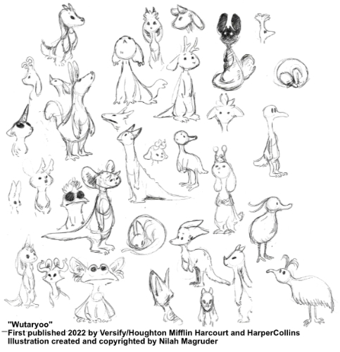
I began the visual development for the book by designing the main character, Wutaryoo. I wanted her to be a cute and appealing creature, but one that does not exist in our world. I drew a page in my sketchbook exploring different looks, thinking about overall shape and various body parts I could add or exaggerate to give her an otherworldly look. In the end I settled on a design that was vaguely squirrel-like, but with large ears and two small horns on her forehead to make it clear she was not truly a squirrel.
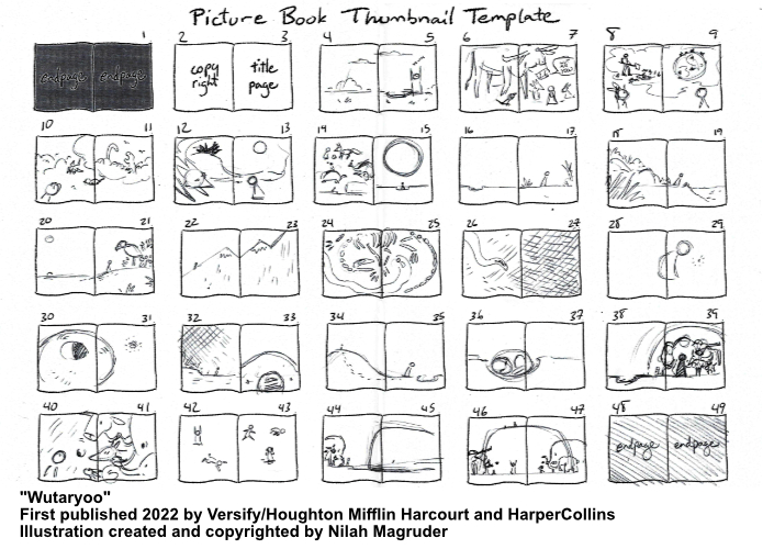
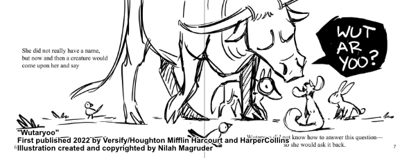
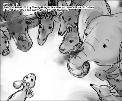
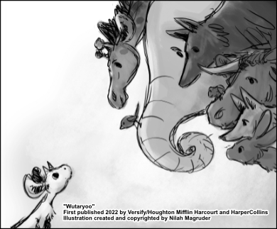
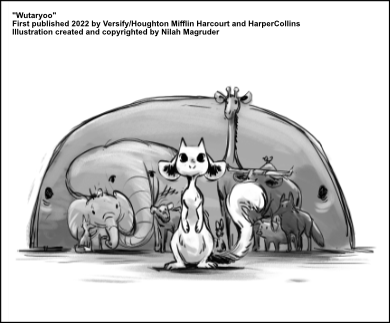
The next step was the picture book dummy. This is a sketched version of the whole picture book that I sent to editors. I organized my pages as spreads and thumbnailed each spread, keeping layouts fairly simple and thinking about how I wanted the story to progress.
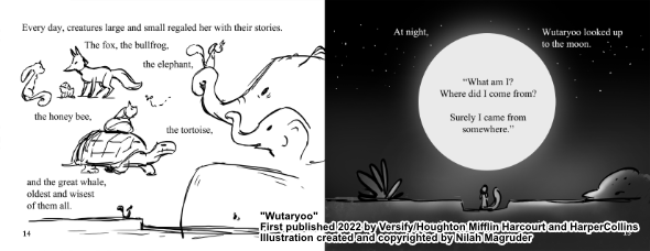
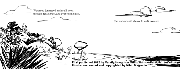
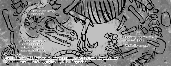
Once I felt good about the thumbnails, I enlarged them as rough black and white digital sketches. I included the manuscript's text at this step to show publishers how I imagined the story flowing.
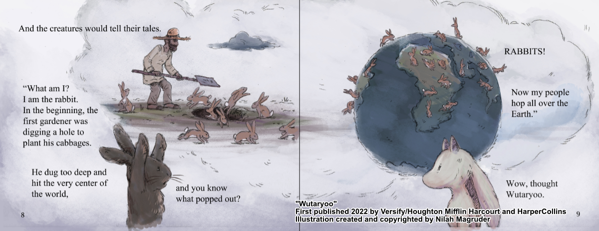
I included two fully colored spreads in the picture book dummy to give publishers an even better idea of how the final book might look. This was my first attempt at a painting style for the book, but I wasn't yet settled on what I wanted the final pages to look like.
After the book sold to Versify, I worked with the editor and designer on polishing the art and text of the picture book dummy.
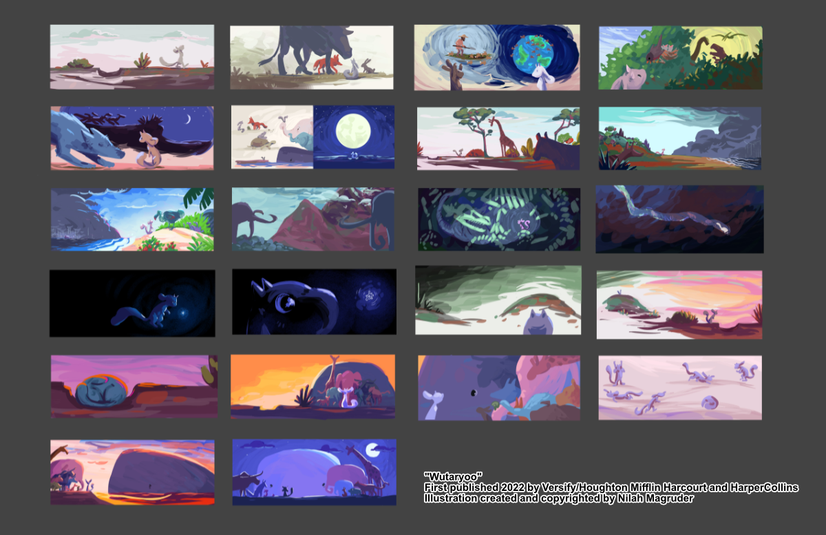
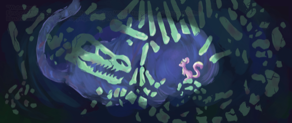
It was finally time for me to think about the final look of the book. I decided to do a color script based on the picture book dummy. These were quick digital paintings focused on color and contrast. I wanted to think about how the colors moved the reader through the story as a whole instead of planning out each page in isolation.
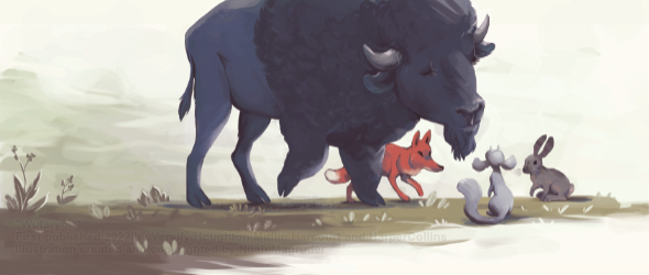
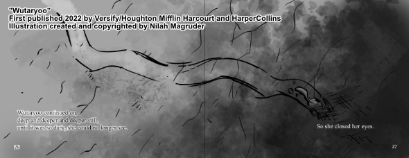
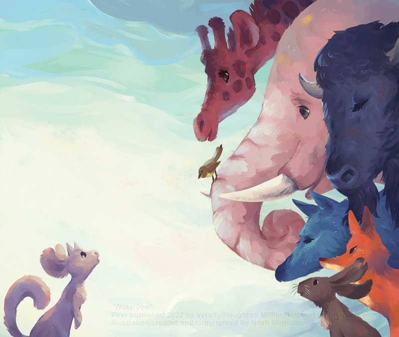
The deadline was tight, so these color thumbnails ended up a pivotal decision that allowed me to paint much faster since I didn't have to spend time making color decisions. I've included a few final illustrations along with their companion picture book dummy versions below.
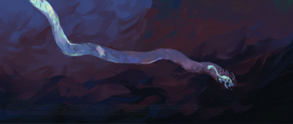
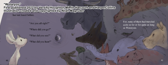
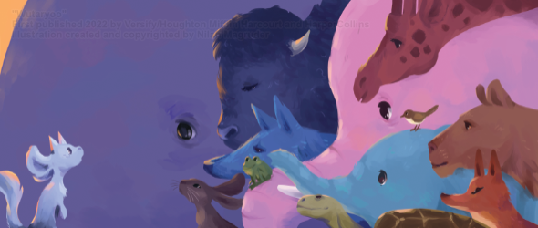
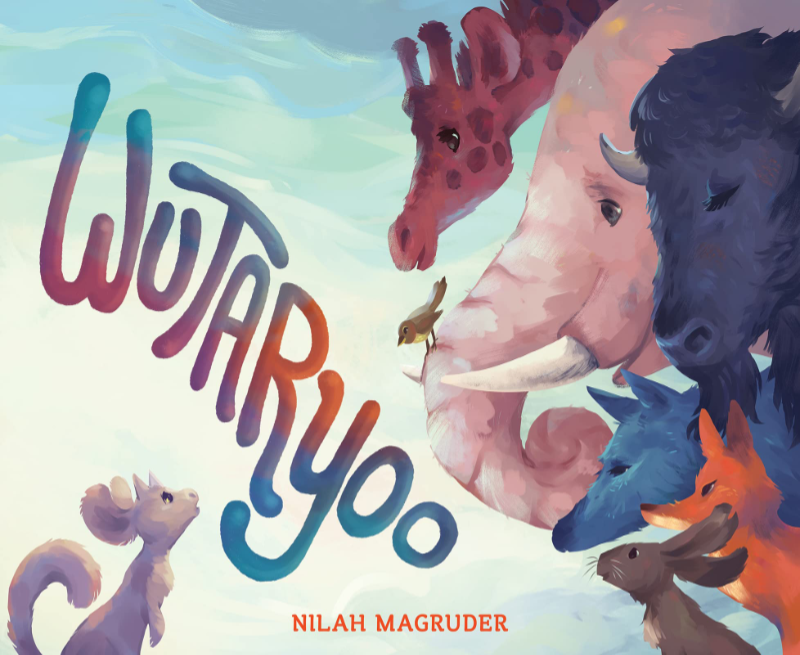
Once the interior illustrations were done, I moved on to the cover.
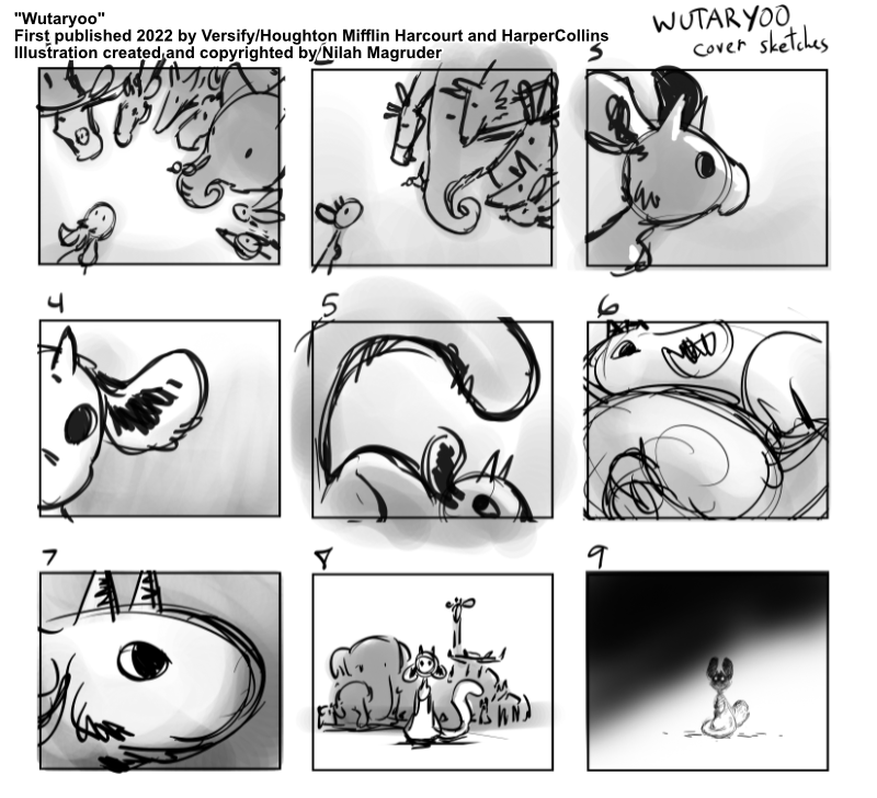
I delivered more layout options to the team than I normally would. I try to limit to 3-5, but the concept of Wutaryoo was so unusual that I didn't have a clear vision of what the cover should look like. There were two main themes I wanted to explore: the mysterious nature of Wutaryoo's identity, and her loneliness. I tried to explore these two themes in as many ways as I could fathom.
The editor and designer isolated three thumbnails that they liked best. I took them and refined them into rough sketches. Then it was onto the final painting.
You can learn more about Wutaryoo and where to buy it in the book section of my website.
Finished? Return to the illustration page.